Putting healthy pops into packaging design that's hot
ITSAPOP FROZEN POPS
Itsapop was born when a seasoned chef with a sweet tooth and a big personality saw a growing need for delicious, anti-inflammatory foods for her clients. Combine that with the romantic hot summers of Chicago, and the demand for these healthier frozen treats took off, leaving the women-led brand's bicycle pop cart peddling fast to keep up.
Elevating what was already a yummy, successful treat came with a brand identity redesign, a new name, a stronger brand voice, and a core key messaging library full of fun, quirk, and undeniable attitude on new packaging design.
SERVICES
NAMING
BRAND VOICE & POSITIONING
BRAND IDENTITY SYSTEM
FOOD PACKAGING DESIGN
BRAND GUIDELINES
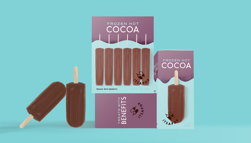
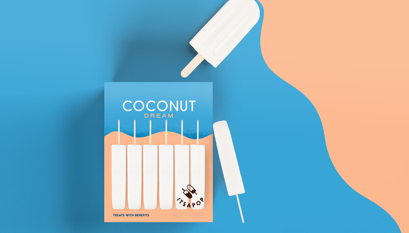
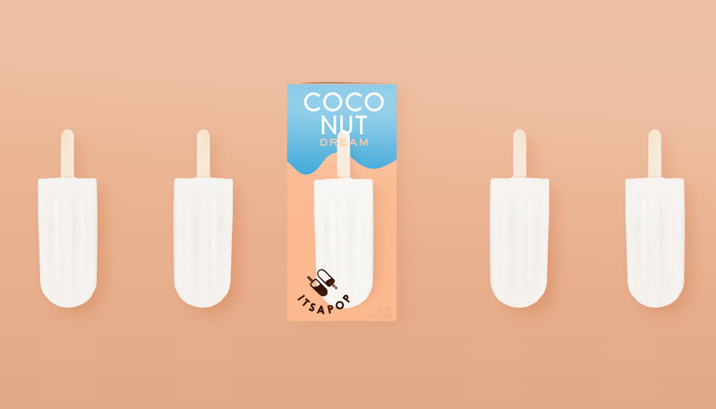
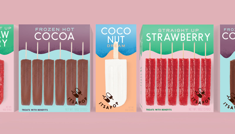
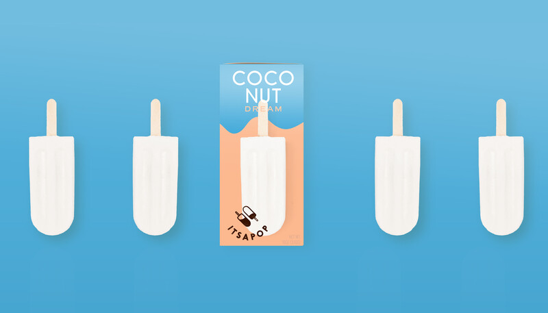
Itsapop's design supports the strategy of balancing function with beauty and celebrates the joy of eating a refreshing frozen pop on a hot summer day. The playful design is undeniably attention-grabbing with a quirky whimsical color palette, infused with a freshness and practicality like no other in it's category.
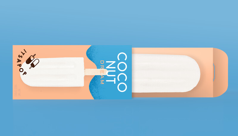
For the gourmet, guilt-free pops we designed a custom box structure to allow retailers to display the brand's products with a long or short "front side" facing consumers. The food photography paired with the two-dimensional textured modern graphic design delivers a captivating box that breaks through the clutter in an often overly saturated frozen area in any retail store. The packaging design also delivers an exciting shelf-blocking experience luring shoppers closer in to learn more.

Stand-out Messaging
The brand is fun and approachable, but also values the beauty of simplicity. It's healthy, it's a cold frozen treat, it's delicious, and it's guilt-free. The messaging was centered around these pillars, while bringing a sense of humor and edgy attitude into the ice cream and popsicle aisle.
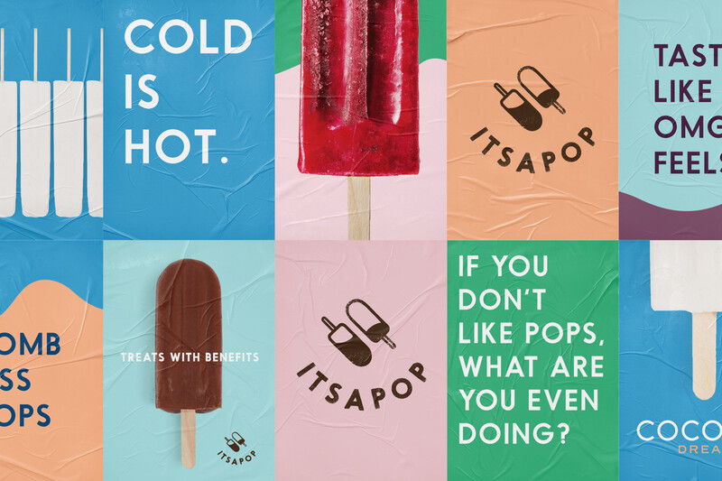
If you don't like pops, what are you even doing?
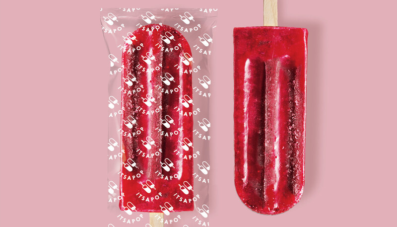
SUBSTRATE
Paperboard Box
Film Sleeve
SECTOR
Food & Beverage
Frozen: Pops & Ice Cream
Consumer Packaged Goods (CPG)
Recent Work Work Gallery