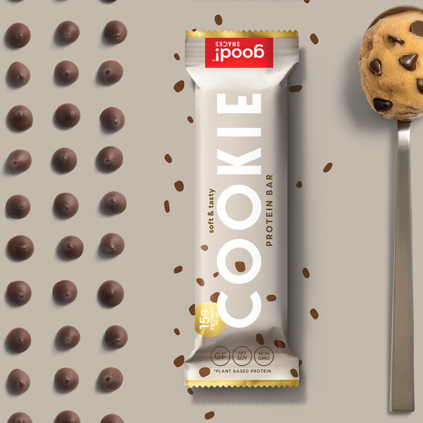
Making healthy feel like a treat
GOOD! SNACKS PROTEIN BARS
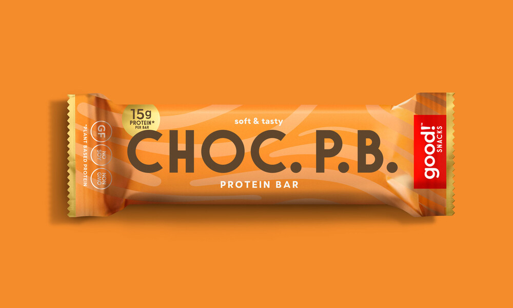
Good! Snacks makes healthy and delicious plant-powered protein bars that can have anyone fooled into thinking they are eating a candy bar. When they reinvented their recipes, they felt they weren’t communicating their products' core benefits, and asked us to redesign and reposition the brand as a treat-focused functional protein bar company.
These bars don’t taste like your average protein bar — they are soft, nougaty, and enrobed in a decadent coating of vegan chocolate. Taking inspiration from the product, we landed on the brand strategy that if it tastes like a candy bar, let’s treat it like one. We reshaped the brand to look and sounds as good as it tastes: more delicious, more craveable, and unlike any other protein bar brand in a very crowded space.
SERVICES
Naming
Tagline Development
Brand Strategy
Brand Voice
Key Messaging
Brand Identity System
Food Packaging Design
E-Commerce Web Design & Development
Photography
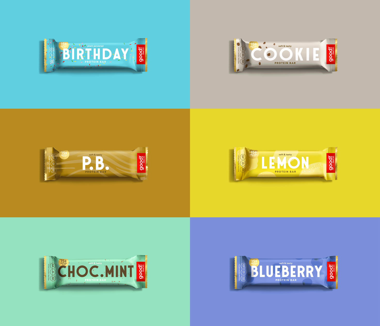
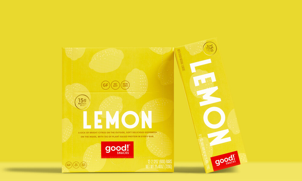
Design Womb delivered a complete kit for Good! Snacks’ relaunch. We started with the brand’s voice and copywriting, which was reshaped to be more playful, and communicate the core benefits around plant-based power and less sugar more clearly.
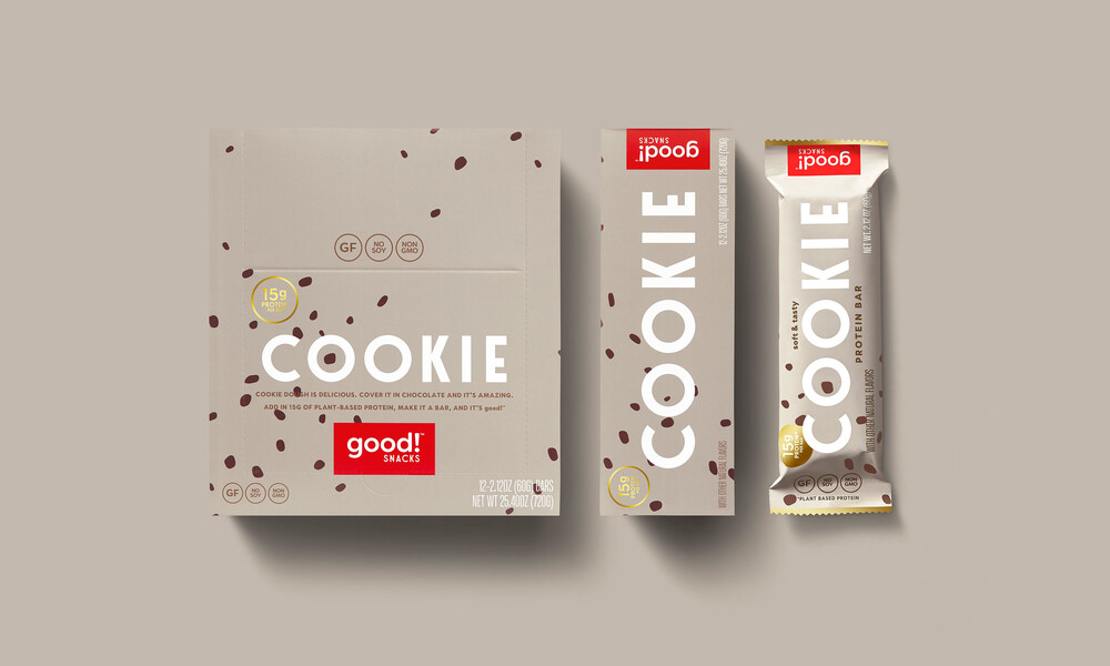
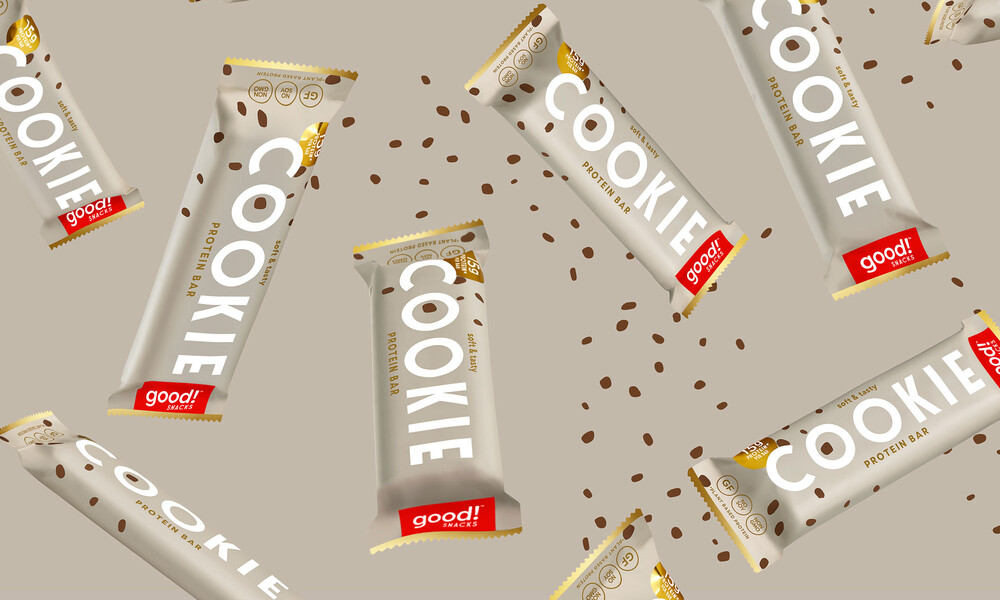
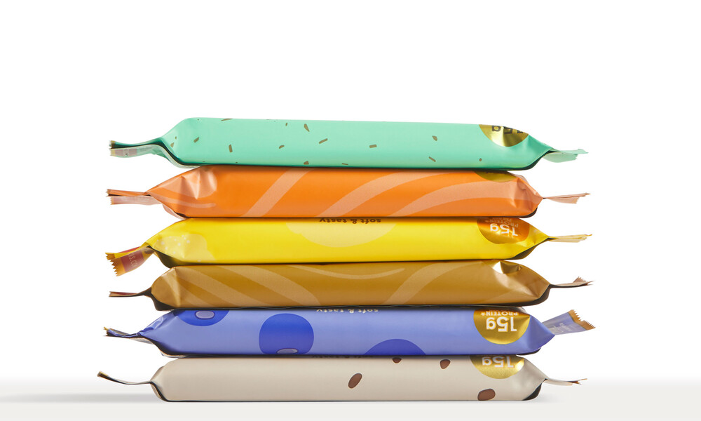
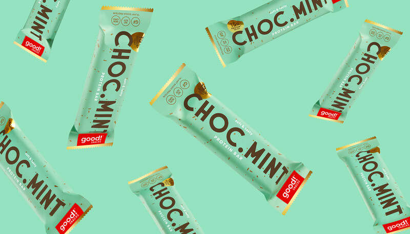
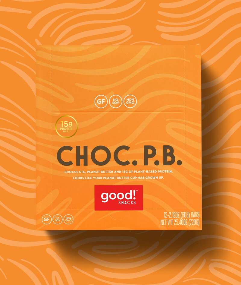
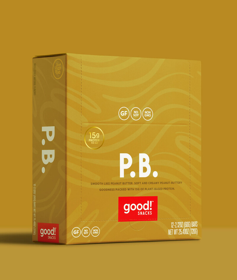
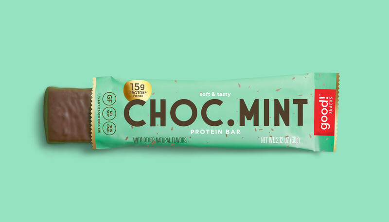
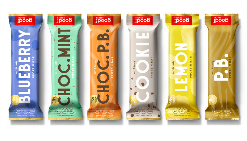
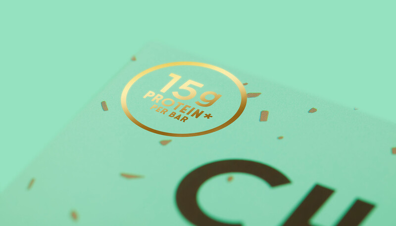
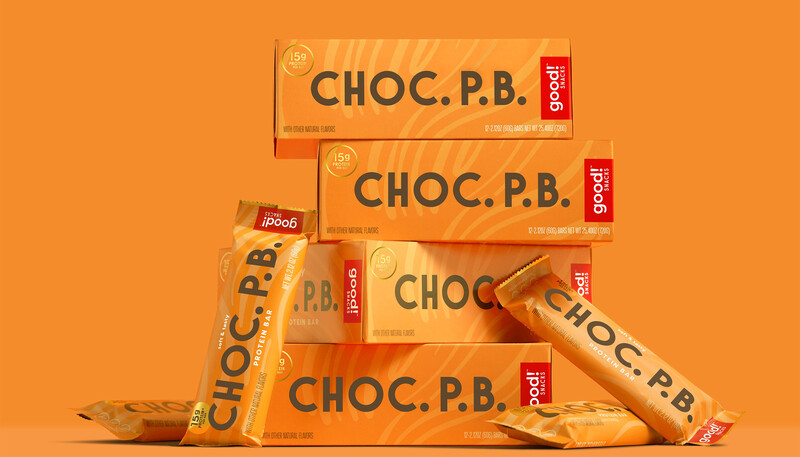
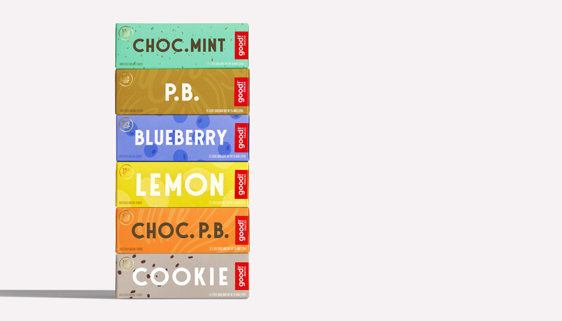
Building around these key differentiators, we redesigned a brand identity that built off of some of their existing logo's equity on the older packaging and paired it with strategic and memorable stand-out product names and bold treat-inspired design. The result is packaging design that communicates clearly, with joyful, whimsical patterns, evocative of classic candy, and stands out amongst other protein bars at retail.
TV-worthy Packaging
With the relaunch of Good!, came sales traction landing the protein bars in Sprouts Farmers Market nationwide. Entering 2020, Good! Snacks have exploded on Amazon, up 300% year-over-year, and are expected to make their national debut in Walmart stores, with continuous positive consumer feedback on the new branding and packaging design.
The bars, having a natural affinity for the media, made their first appearance with Daphne Oz on The Dish on Oz, and the eye-catching packaging design caught the attention of the prop styling team on the hit HBO television series Curb Your Enthusiasm, where the packaging design was prominently styled onto the counter of Larry David’s coffee shop on the 100th episode. The bars have also had another HBO cameo on the comedy series, Silicon Valley.
Photography, Teri Lyn Fisher
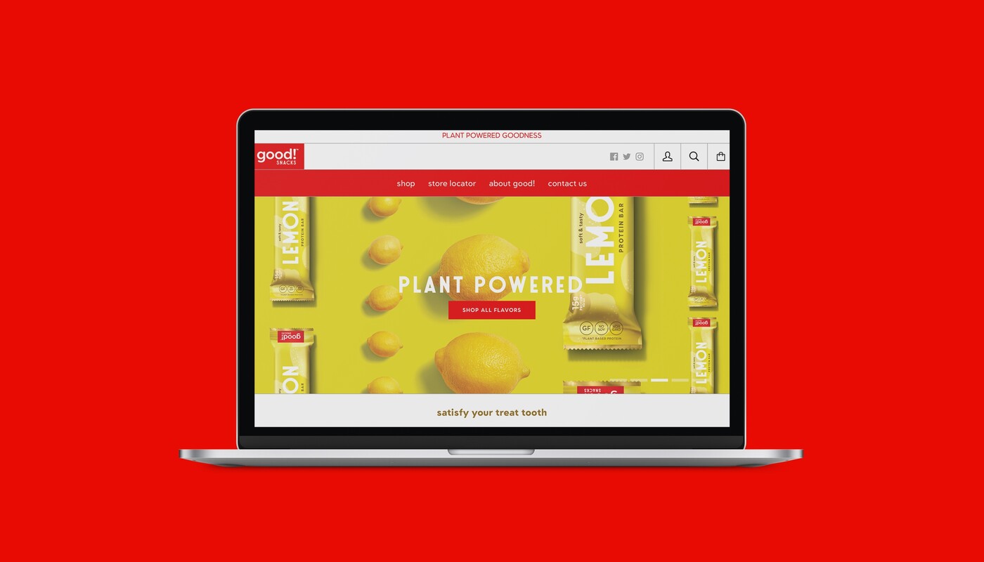
For the launch, we also executed supporting art direction for digital creative content, including product animations with a fun candy culture spin, and bright, colorful photography to be used on the brand’s Shopify e-commerce website, which we designed and launched the brand’s new look on.
"The team designed branding and packaging that drove significant sales growth and opportunities. They are mindful of the online and in store environment and delivered a package that pops! Buyers love the packaging, and it has helped a small startup brand open doors to the country’s largest retailers."
Lindsay | Good! Snacks – VP Marketing & E-Commerce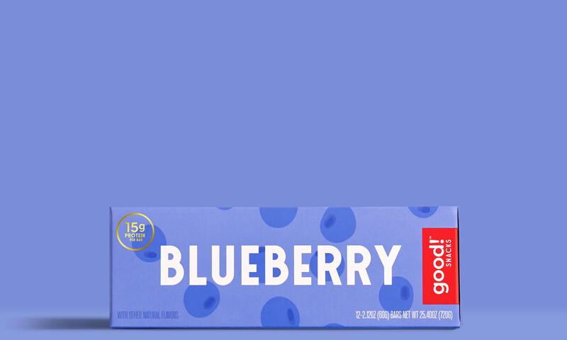
Accolades
The Dish on Oz, Snack of the Day with Daphne Oz, The Dr. Oz Show Television Feature
Curb Your Enthusiasm, Episode 100 "The Spite Store” with Larry David, HBO Hit Television Series Appearance
Silicon Valley, HBO Hit Television Series Appearance
goodhousekeeping.com, 13 Best Protein Bars, According to a Nutritionist, Press Feature
