Bringing snacking back to basic
BASIC BITS
Basic Bits is a Miami Beach startup that is bringing nutrition back to basics by combining whole, high quality ingredients into craveable raw snack balls that are so good, you’ll forget they’re healthy.
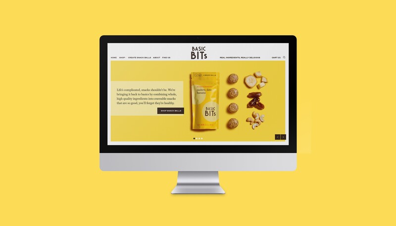
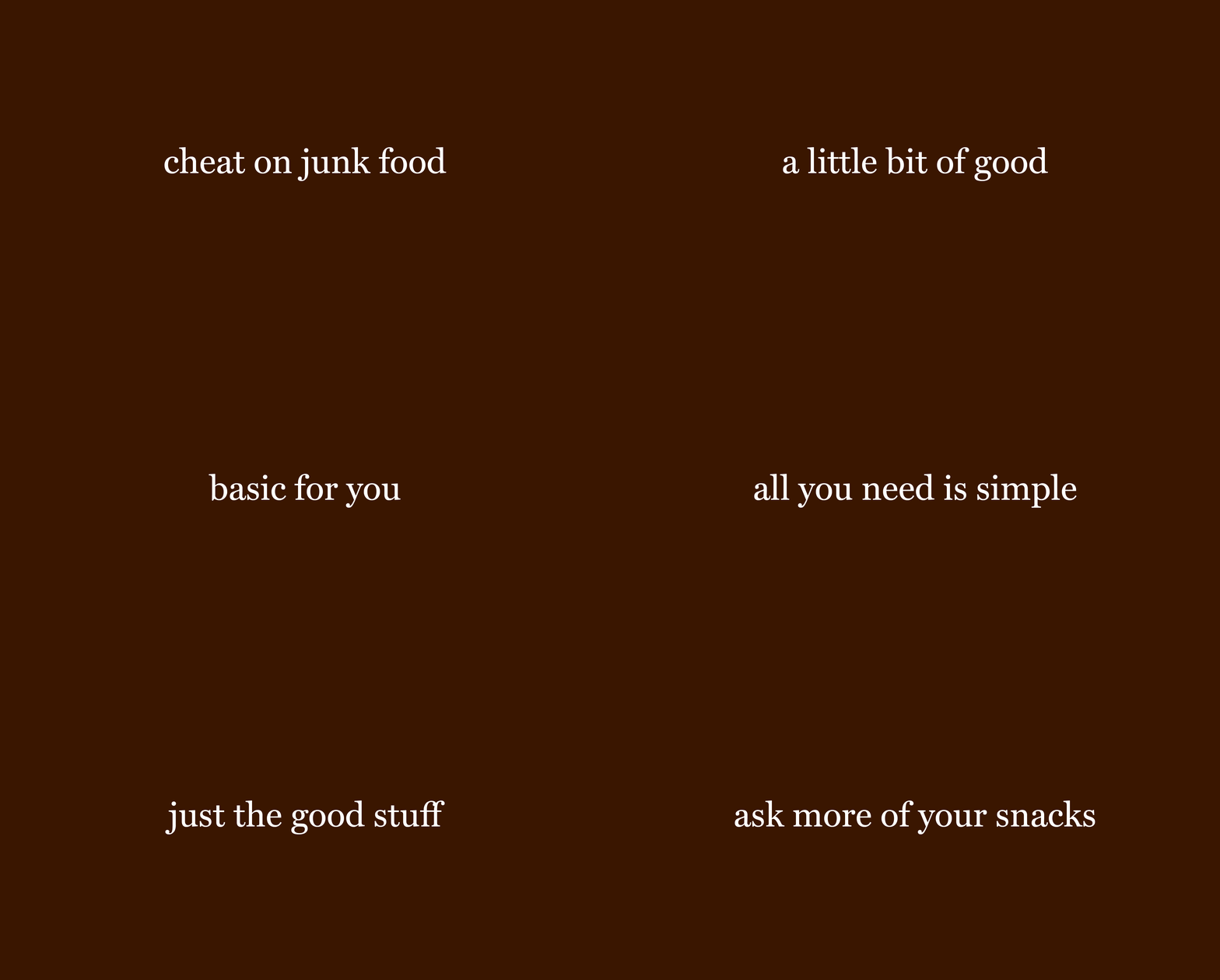
Basic Bits’ mission is clear, to simplify healthy snacking. We built the brand’s strategy, visual identity, and voice around bold simplicity. We used striking color, and simple but bold key messaging that grabs the attention of shoppers quickly.
SERVICES
NAMING
TAGLINE DEVELOPMENT
BRAND VOICE
KEY MESSAGING
BRAND IDENTITY SYSTEM
FOOD PACKAGING DESIGN
E-COMMERCE WEBSITE DESIGN & DEVELOPMENT
ART DIRECTION
PHOTOGRAPHY
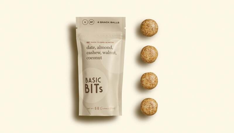
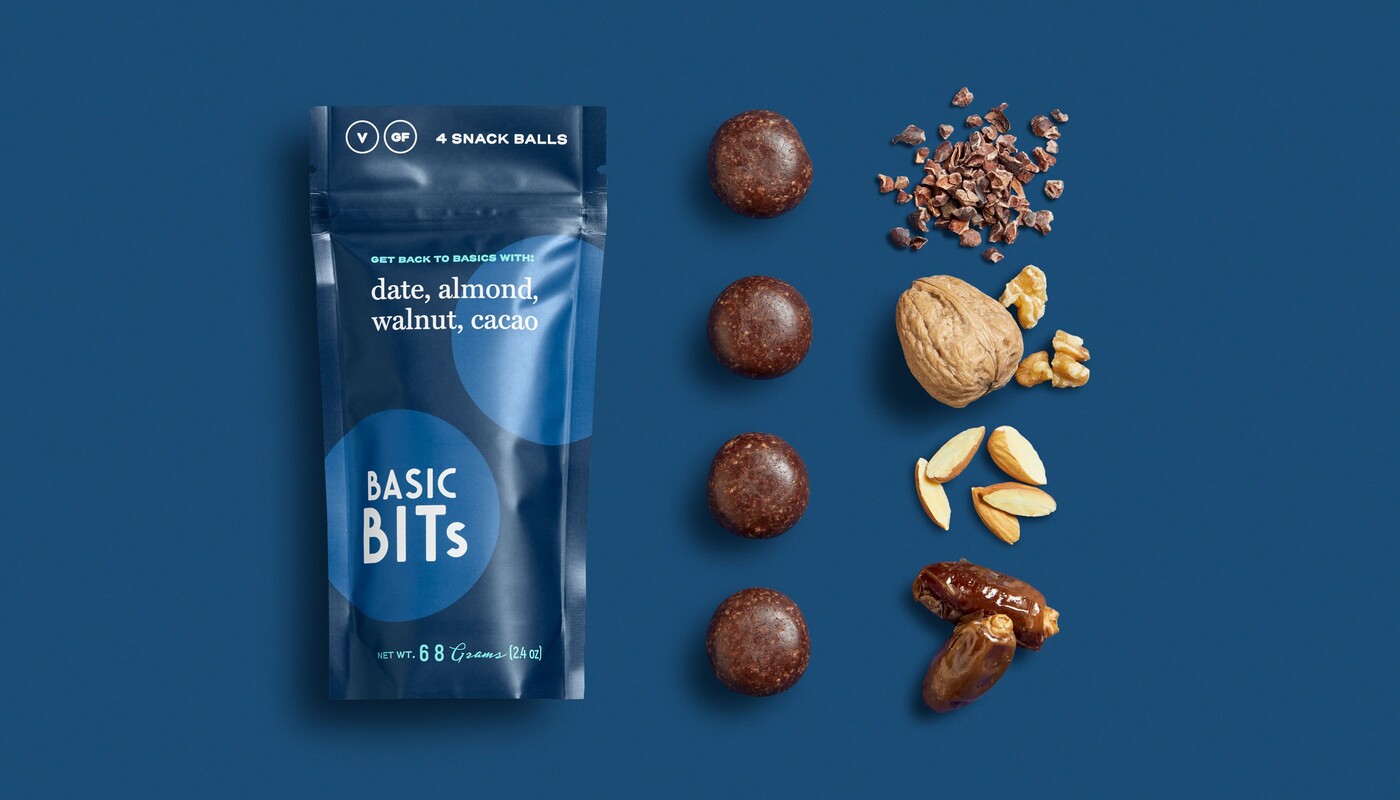
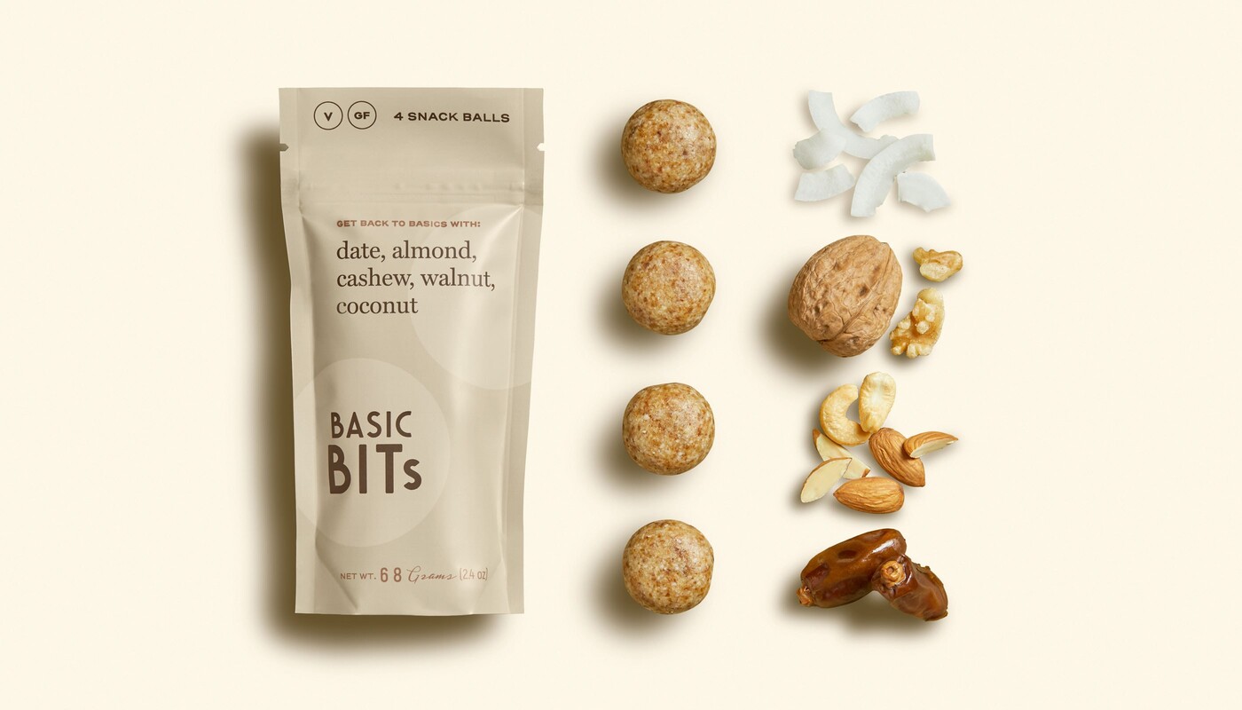
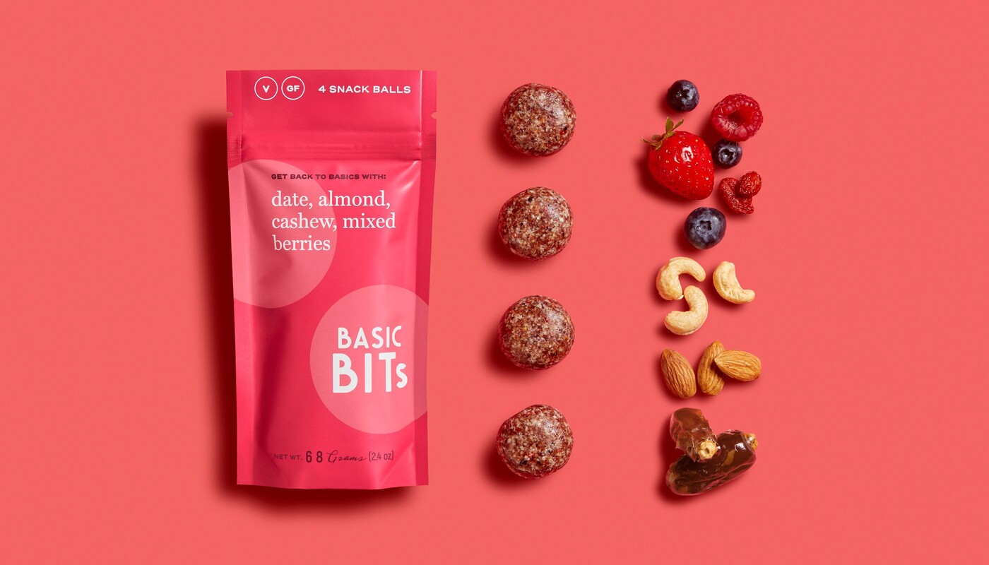
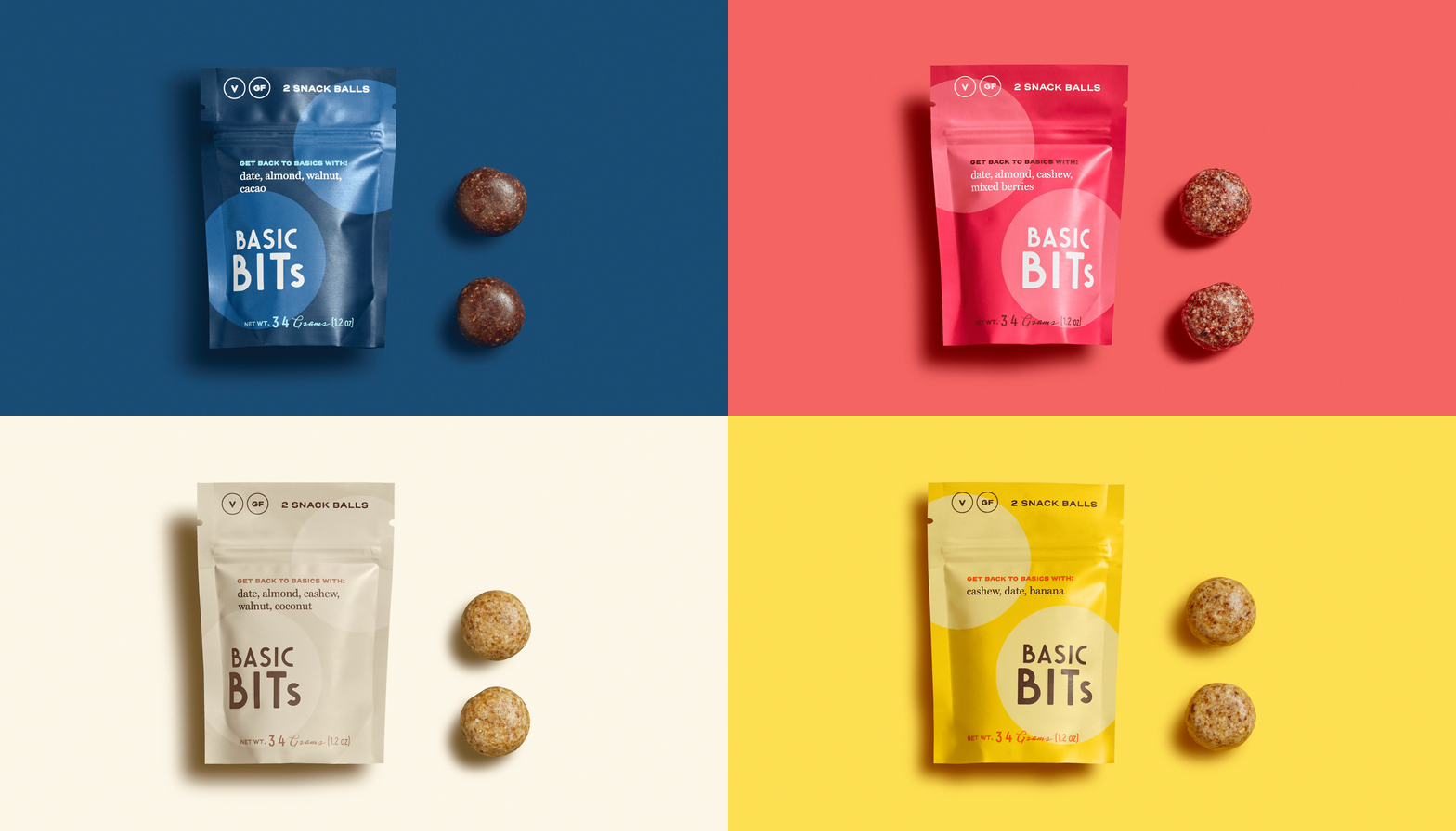
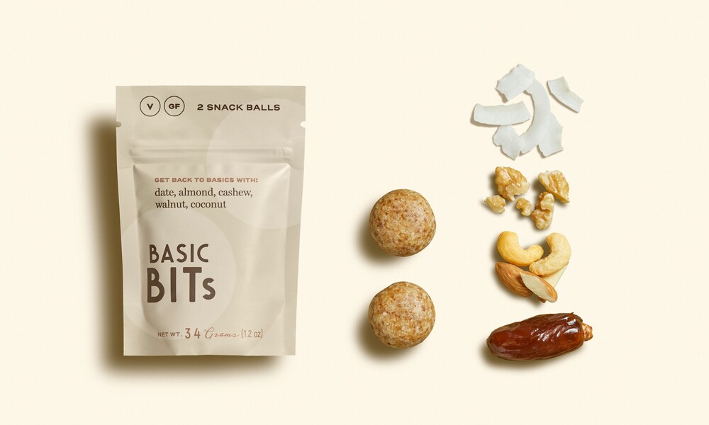
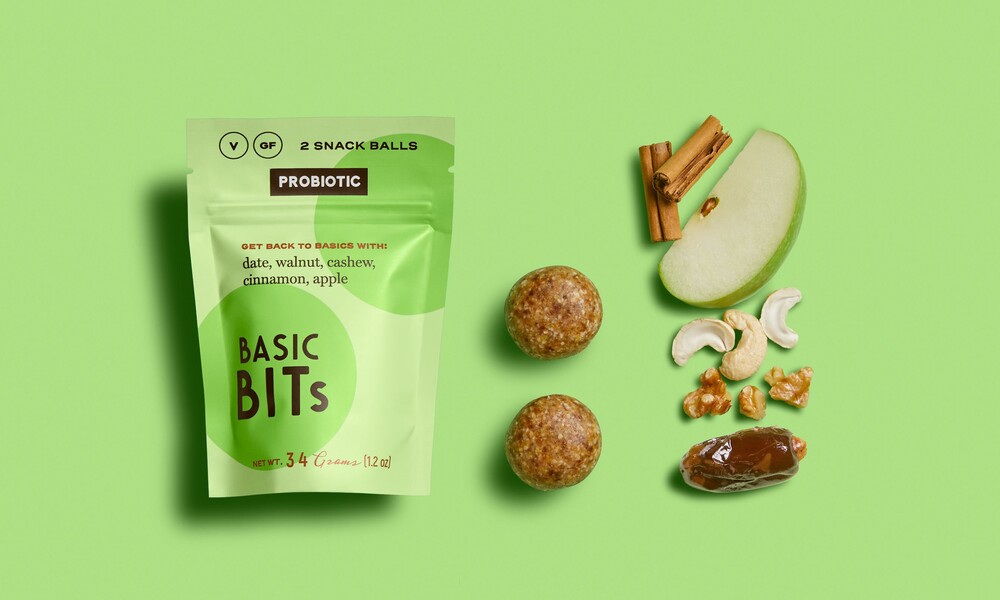
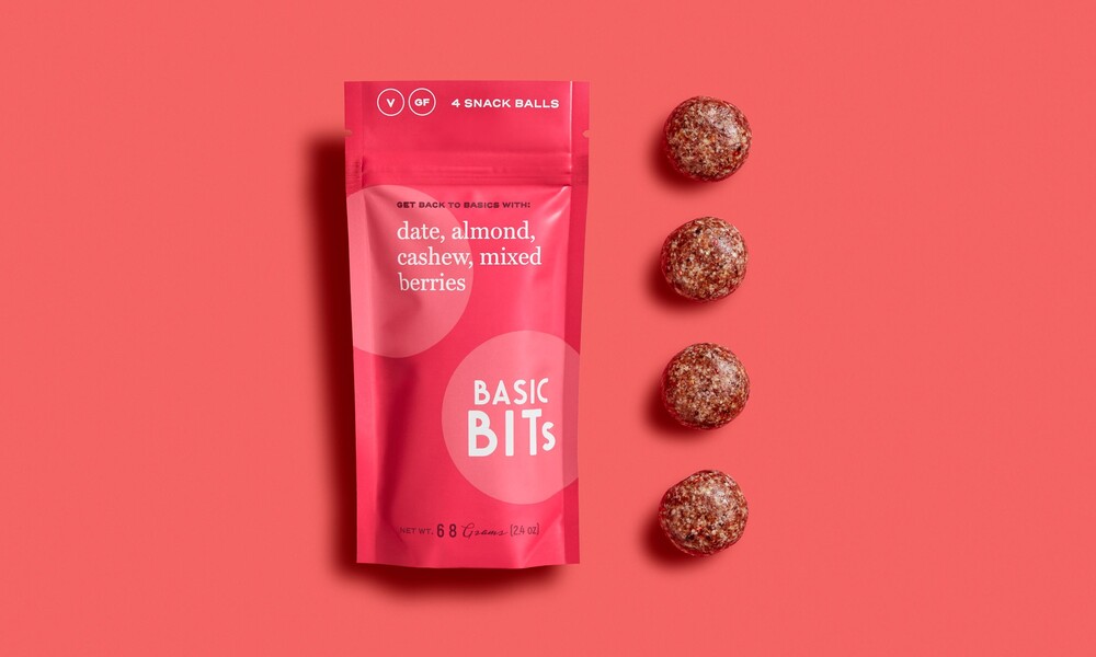
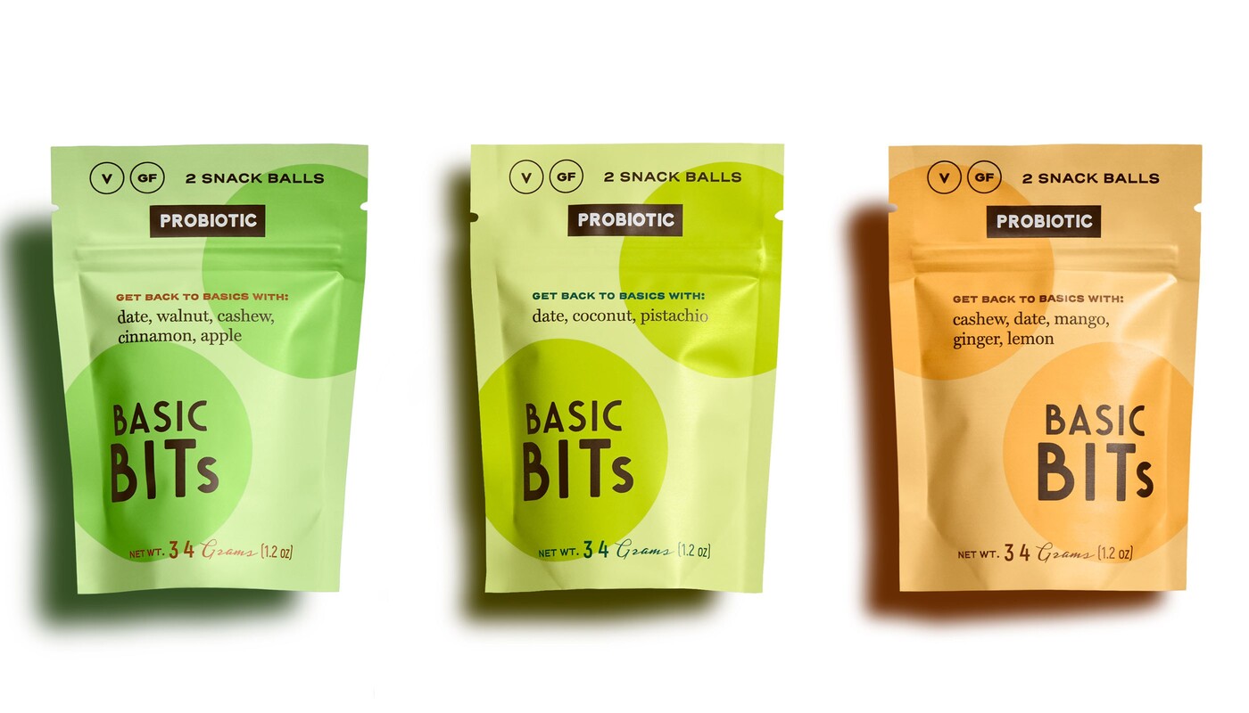
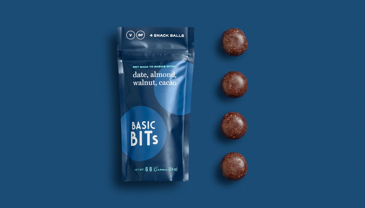
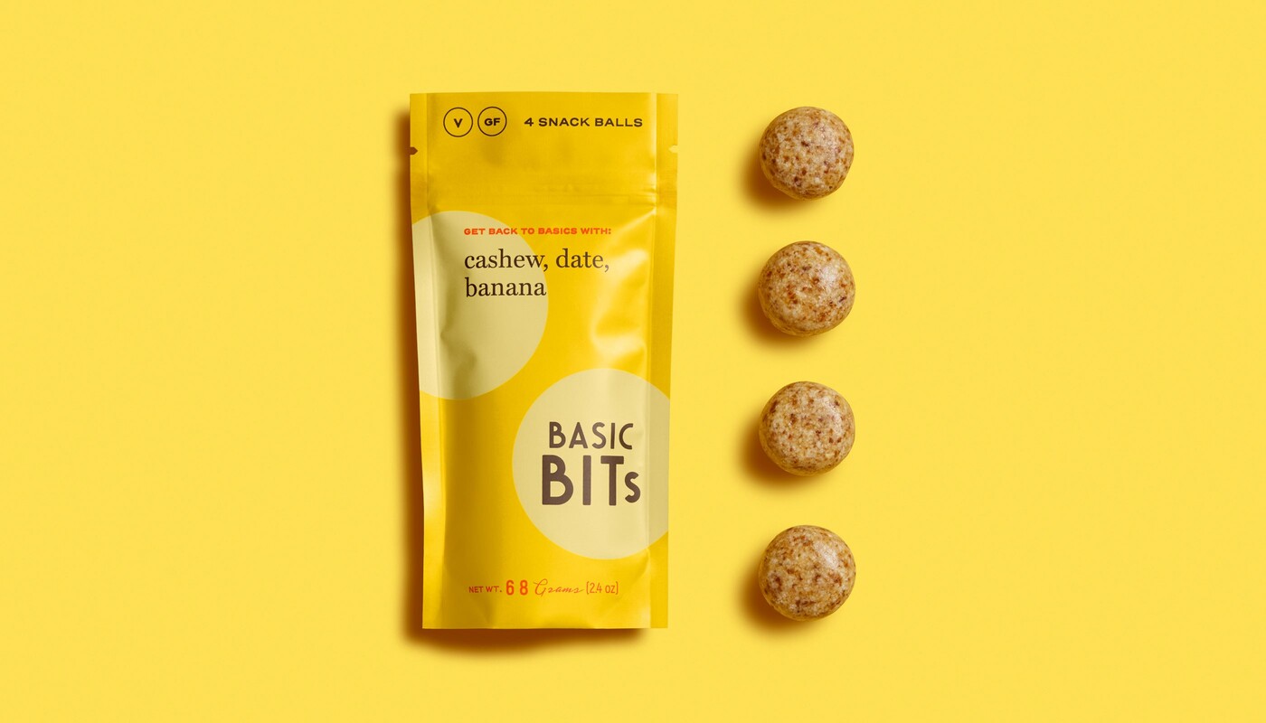
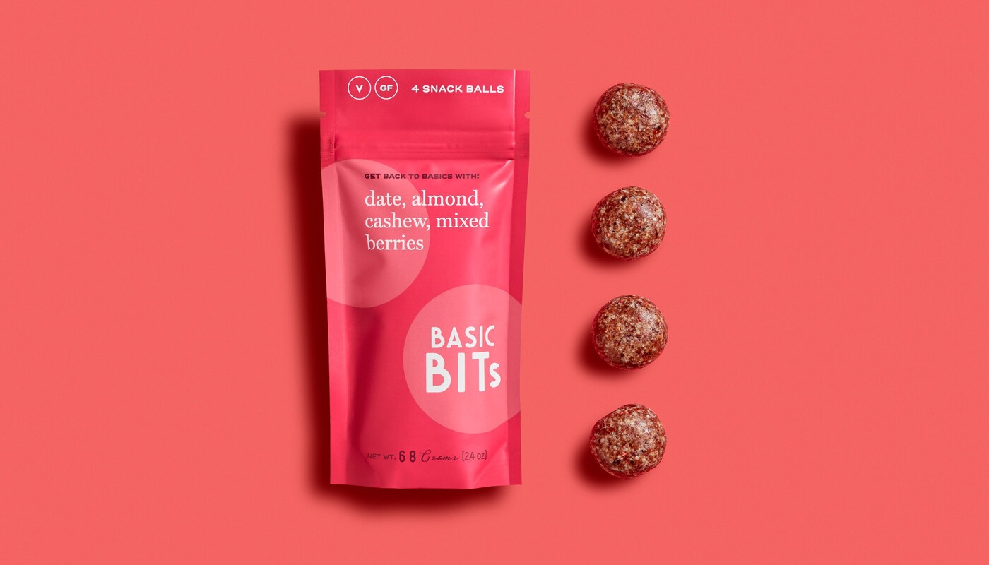
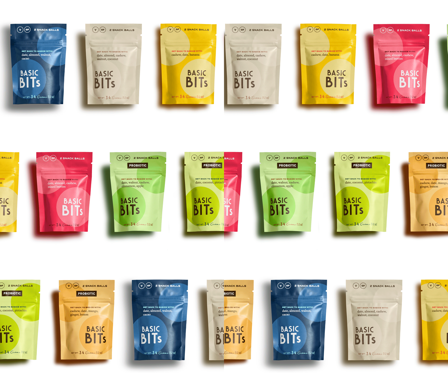
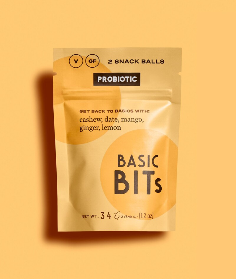
We developed a visual identity that’s simple and clear, and the packaging design's no fuss attitude tells you exactly what you are about to eat on the front of each bag. The choice to initially launch with a basic primary color palette further enhances our “back to basics” strategy. A secondary color palette was introduced later for the brand's functional probiotic snack ball extension line.
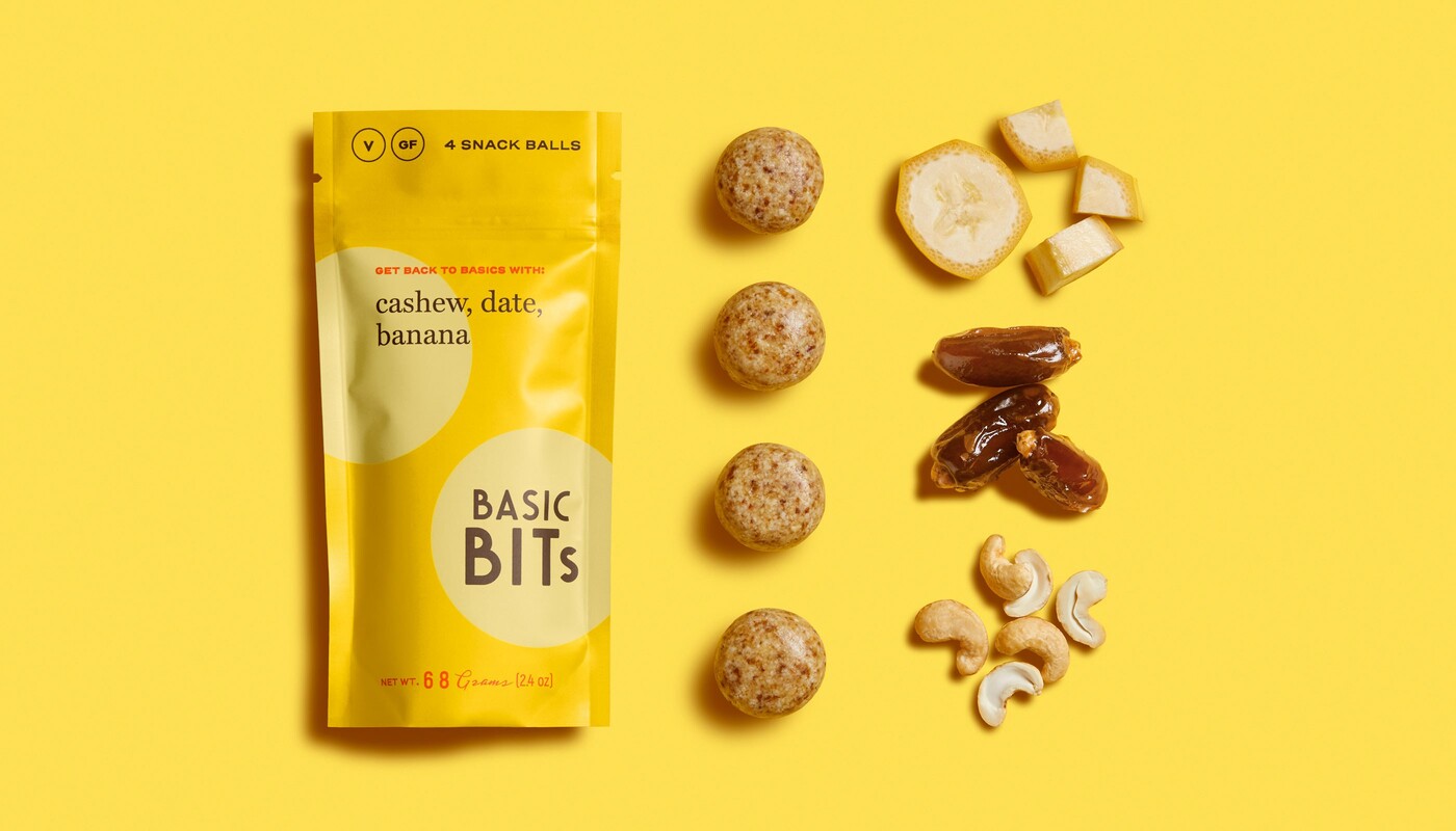
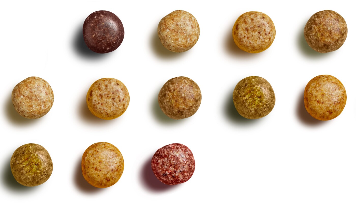
We also produced, art directed, and executed the brand’s product photography, which uses bold graphic layouts paired with vibrant color, telling a very clear visual story about the simple ingredients in each flavor.

Small Batch Packaging
Like many food startups we work with, Basic Bits' founder was new to the food business industry. Design Womb helped pave the way forward in many uncharted territories, including group consulting with our team, and our favorite go-to industry retail ready expert from our trusted network of resources.
The startup's founder also wanted professional printed packaging at launch, while rolling out limited quantities for each of its SKUS. We sourced and established the right print vendors for smaller minimum order quantities, to help fill in gaps while the brand initially launched without compromising beautiful packaging design.
PHOTOGRAPHY, Teri Lyn Fisher
