Redesigning a 150 year old meat company
PEER FOODS
Peer Foods is a passionate, smoked meat-obsessed Chicago company that has been providing premium handcrafted meats since 1867. They practically invented the food coma.
To celebrate 150 years and an expansion into retail, the company came to Design Womb for a brand and packaging design makeover. The results – compelling meat packaging with meat-centric messaging, an approachable brand identity with Midwestern vibes, and a visual story rich with history and brand equity of a well-established heritage brand.
services
BRAND VOICE
TAGLINE DEVELOPMENT
KEY MESSAGING
BRAND IDENTITY SYSTEM
FOOD PACKAGING DESIGN
PRINT COLLATERAL
ART DIRECTION
PHOTOGRAPHY
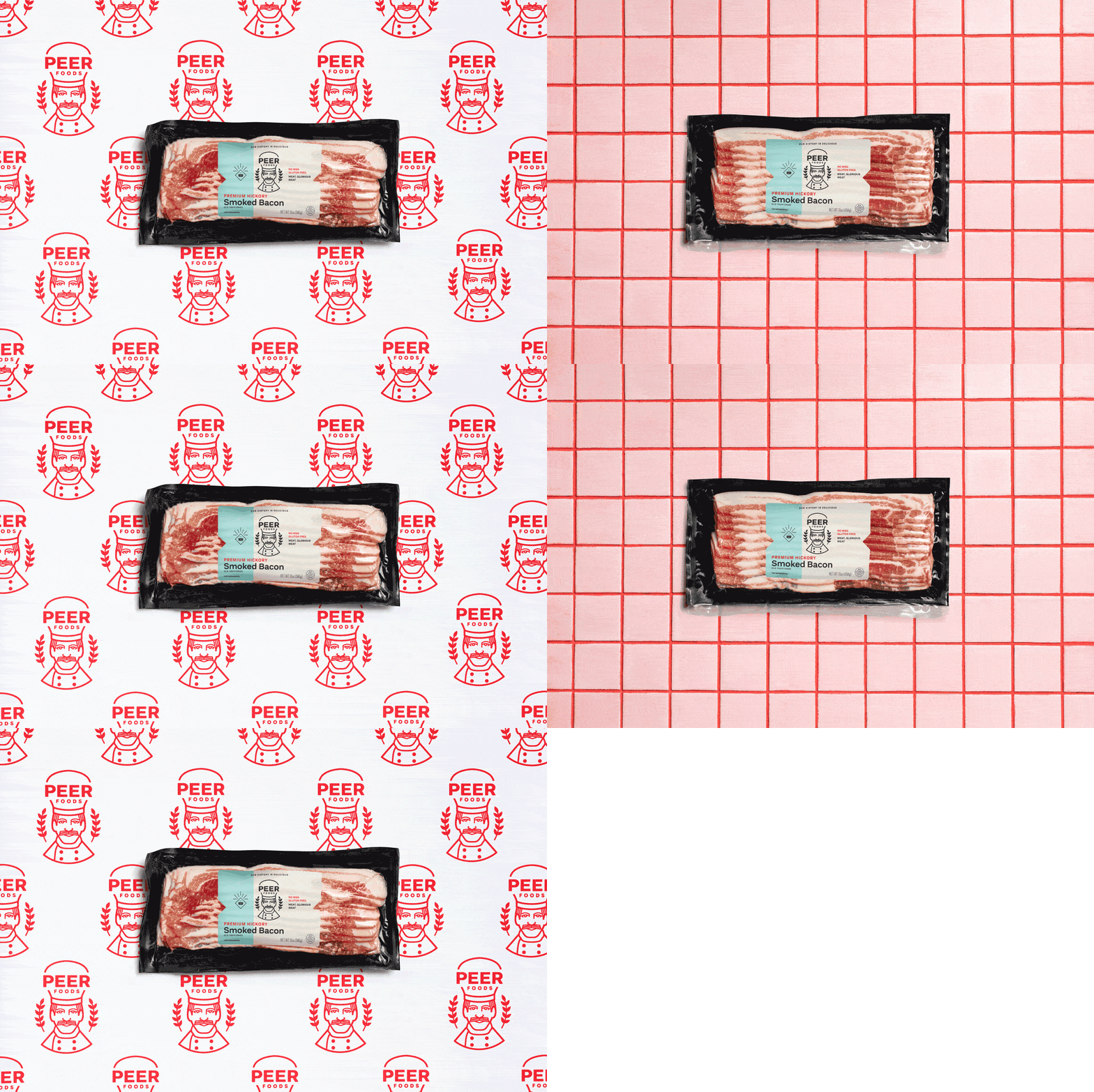
We took a brand mark that has been around in different versions for the better part of a century and delivered a modernized Chef logo design emphasizing the care and quality they put into their meats and company's culture. It was important to capture a balance in the verbal and visual language that is playful, while remaining smart and confident.
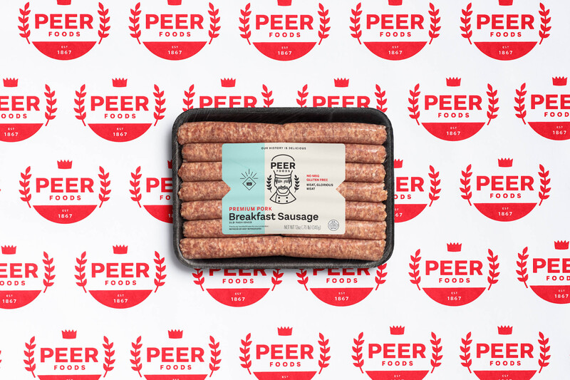
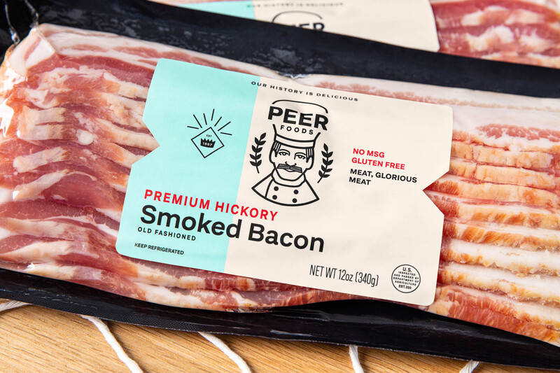
The brand redesign strategy aims to attract new consumers without alienating loyal existing ones or losing familiarity. The updated color palette is crisp and simple, and subtly infuses the brand’s proud Chicago roots. The bacon and breakfast sausage meat packaging design balances a smart utilitarian look which breaks through the clutter in an overly masculine meat category.
Meat, Glorious Meat
As a brand that doesn’t take themselves too seriously, and aren’t afraid of fun, Peer Foods embraced a brand voice kit with messaging that always sounds human, never cold, and makes you laugh a little.
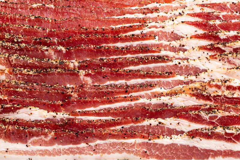
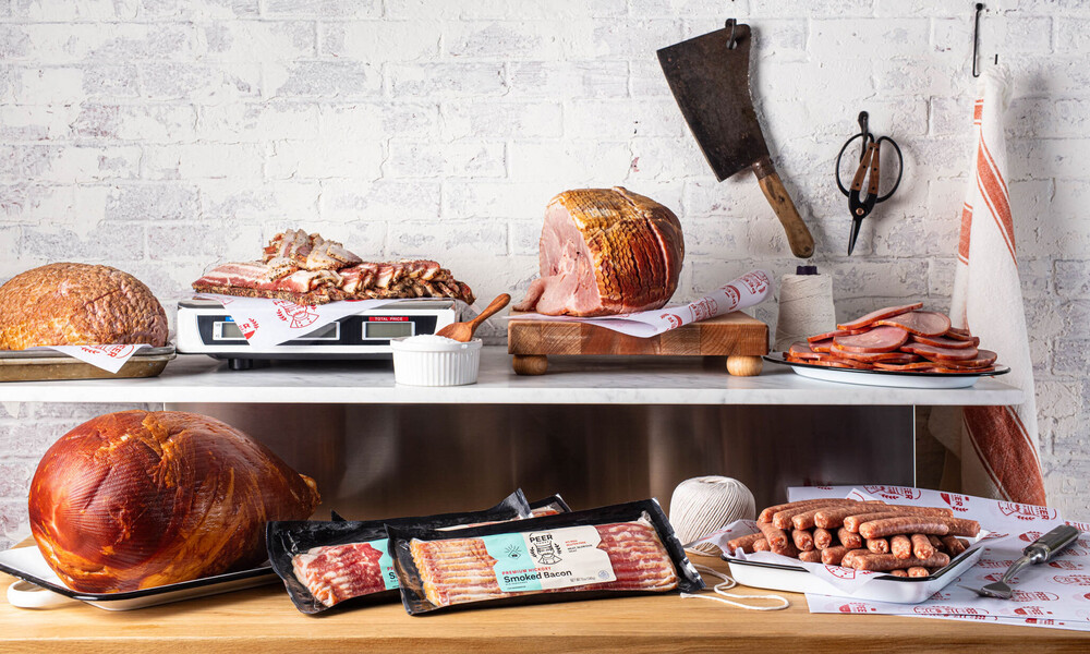
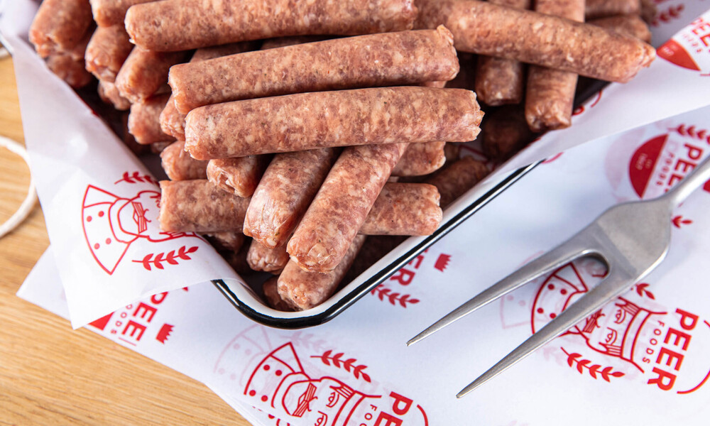
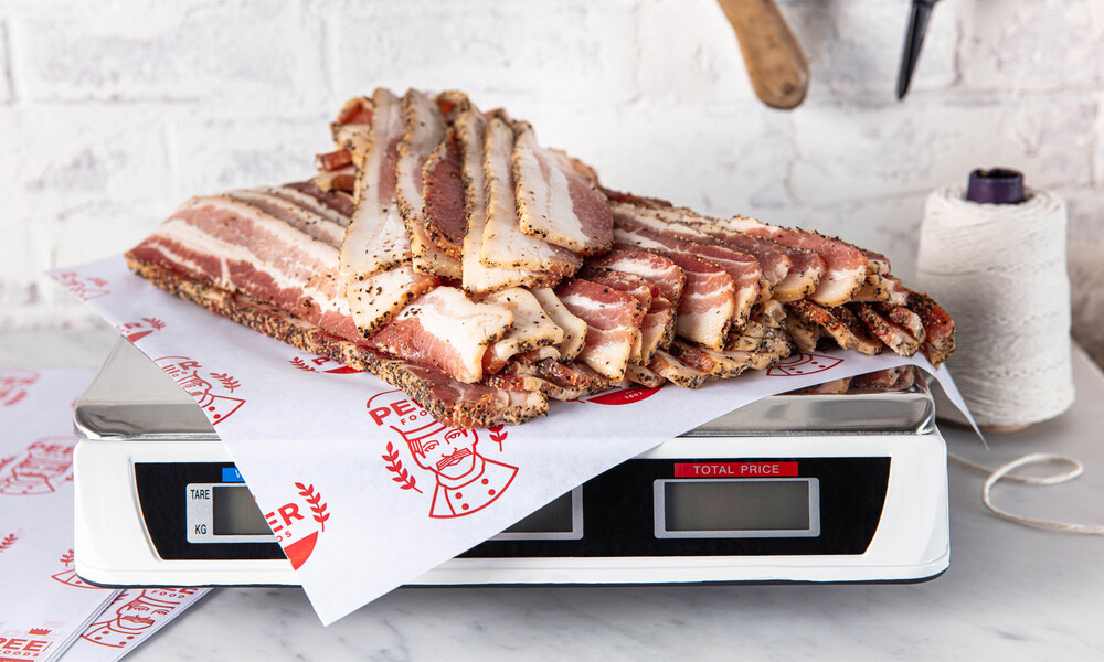
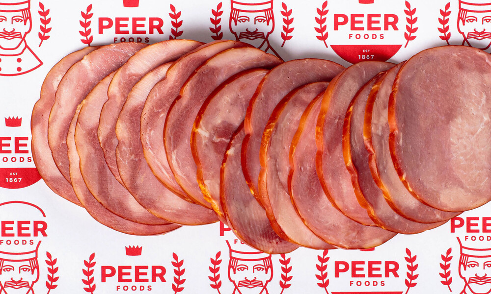
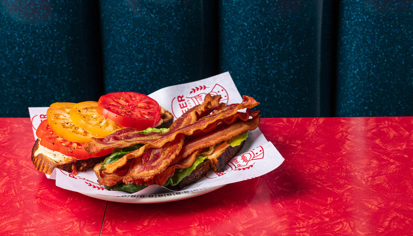
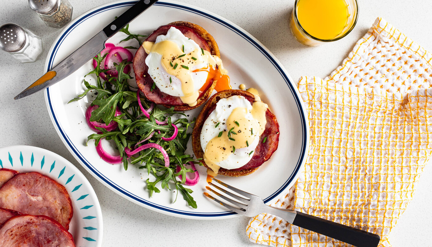
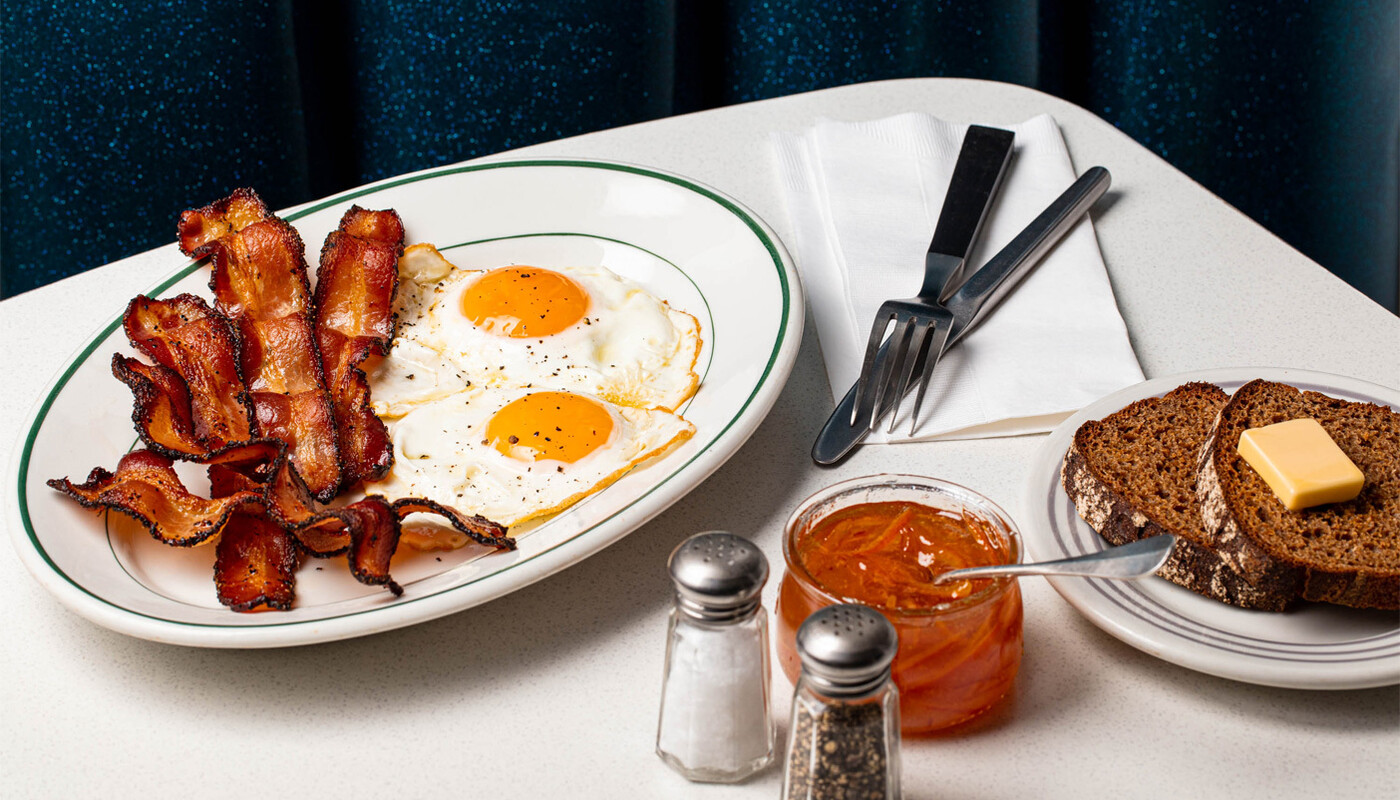
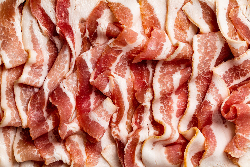
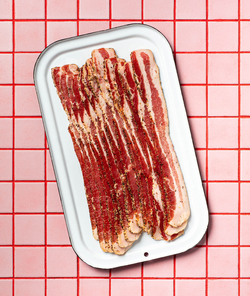
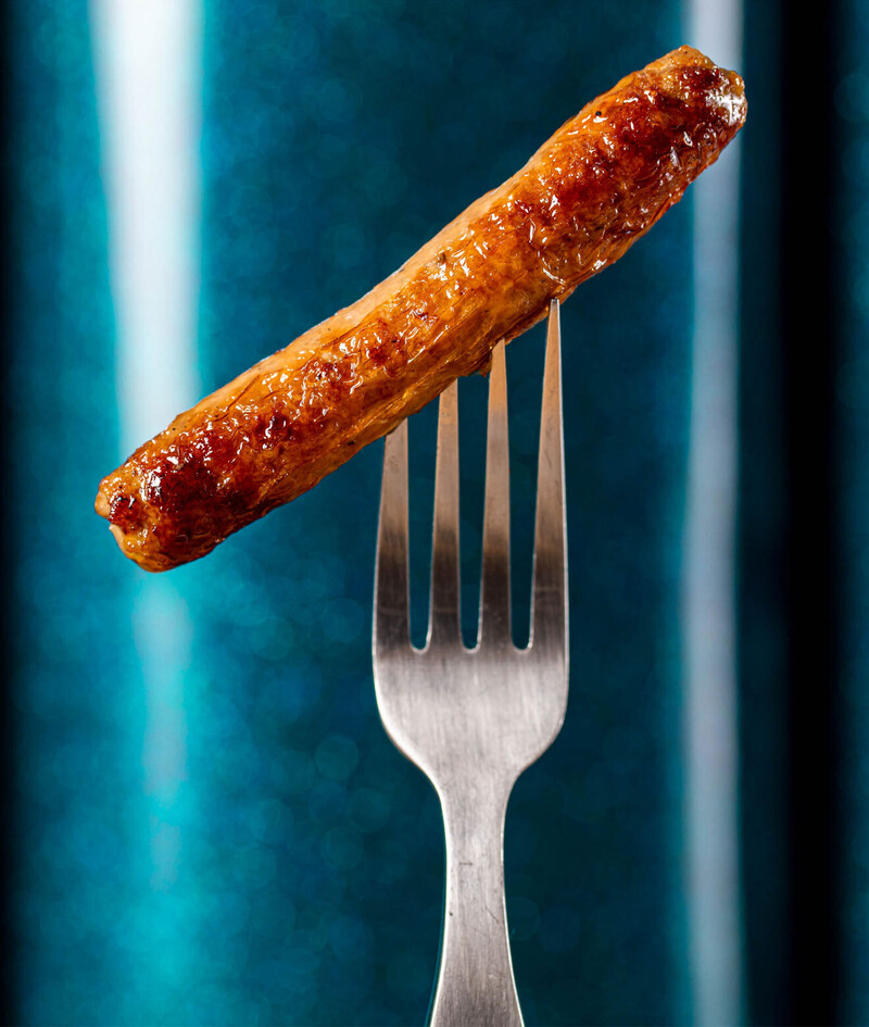
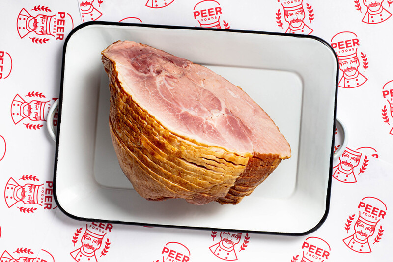
Playful photography art direction with a touch of nostalgia continue to enhance the brand’s visual story. Utilitarian packaging design product shots are paired with juicy, delicious meat details, and juxtaposed next to meals you might grab at a classic Chicago diner.
Photography by Erin Scott
key messaging
