Hard seltzer, easy living
Cheeky is the lighter side of hard. Designed to be drinkable, delicious, and not take itself too seriously, Cheeky reflects the ethos and personality of its founders, two close friends who couldn’t find their version of a perfect drink, so they created it.
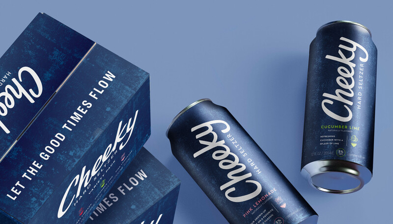
We helped launch Houston’s homegrown hard seltzer with approachable and playful branding that focuses on a custom wordmark on the ready-to-drink’s simple, slightly familiar feeling, and sleek packaging design, so there’s no mistake that that’s a Cheeky in your hand.
SERVICES
BRAND VOICE
TAGLINE
BRAND IDENTITY
DRINK PACKAGING DESIGN
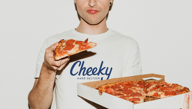
Low calorie, gluten free, and packed with taste, Cheeky’s ready-to-drink hard seltzers promote fun and enjoyment. And unlike most other hard seltzers, Cheeky isn’t loaded with sugar to taste great.
We designed a set of custom flavor icons that pair with the custom wordmark and brand’s beach-inspired texture on the recognizable navy cans. The icon’s feature a visual slice of Cheeky’s signature flavor line up of pink lemonade, cherry limeade, and cucumber lime, which are also indicated through a fresh color palette.
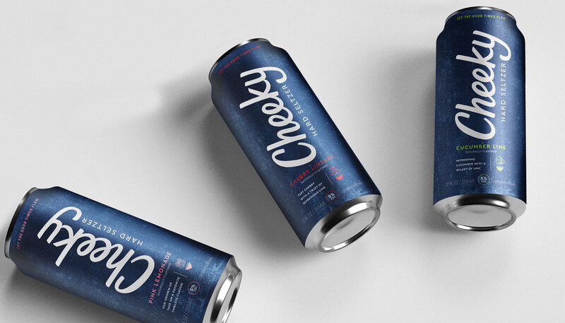

Cheeky – Let the Good Times Flow
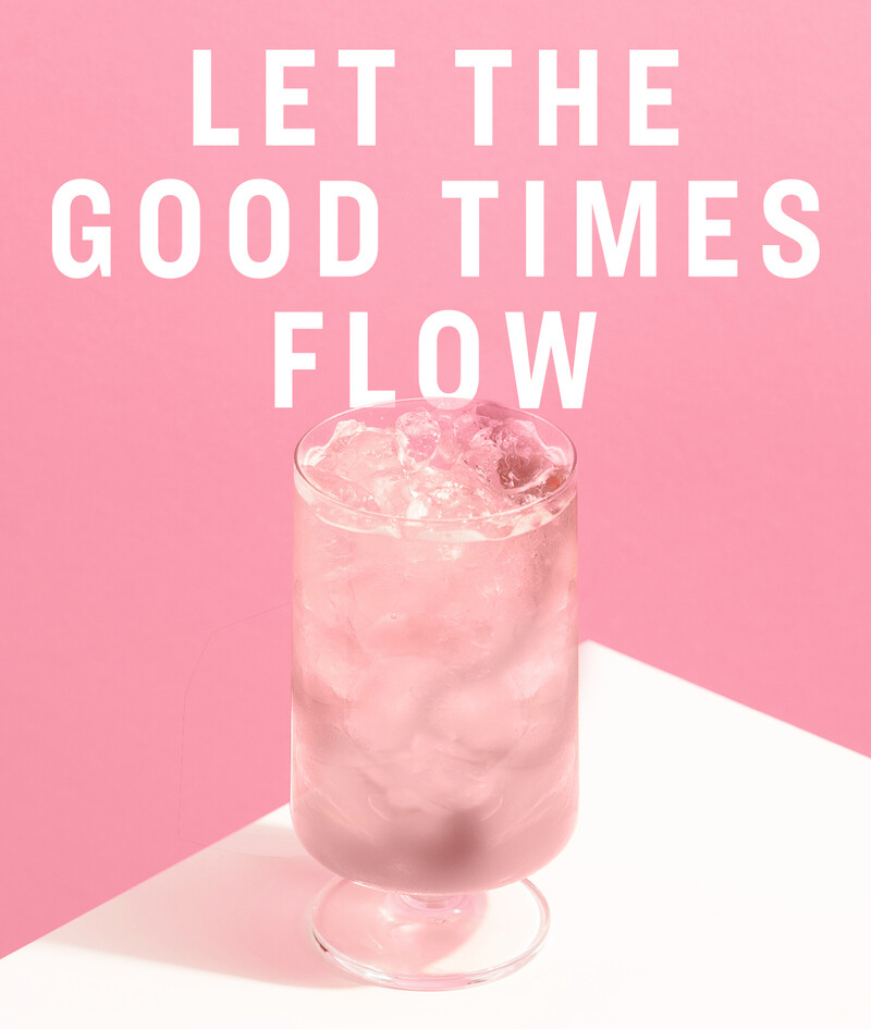
Cheeky focus on the good, the fun, the silver lining. We crafted an optimistic brand voice that champions being social, plays it a little bold, and is always casual. The tagline Let the Good Times Flow says it all.
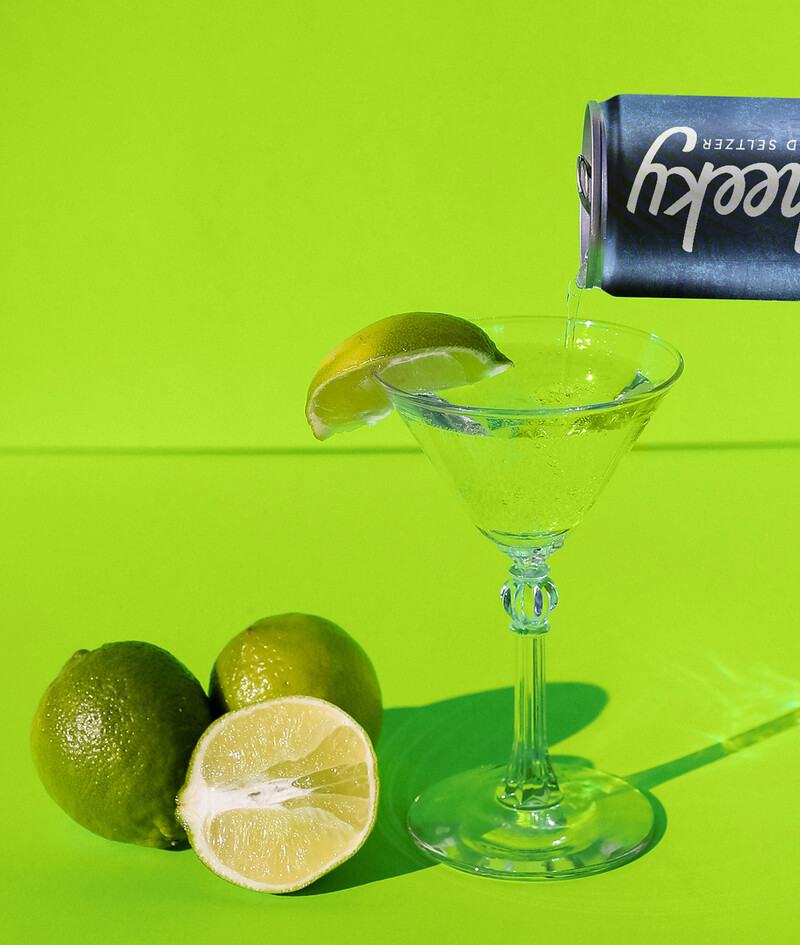
The lighter side of hard
Let your cheek flag fly.